Ukandu Brand Identity
About The Project
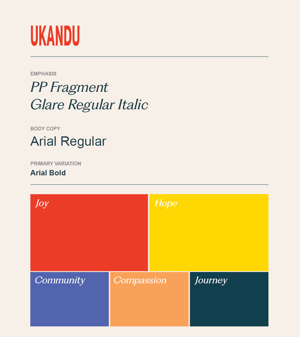
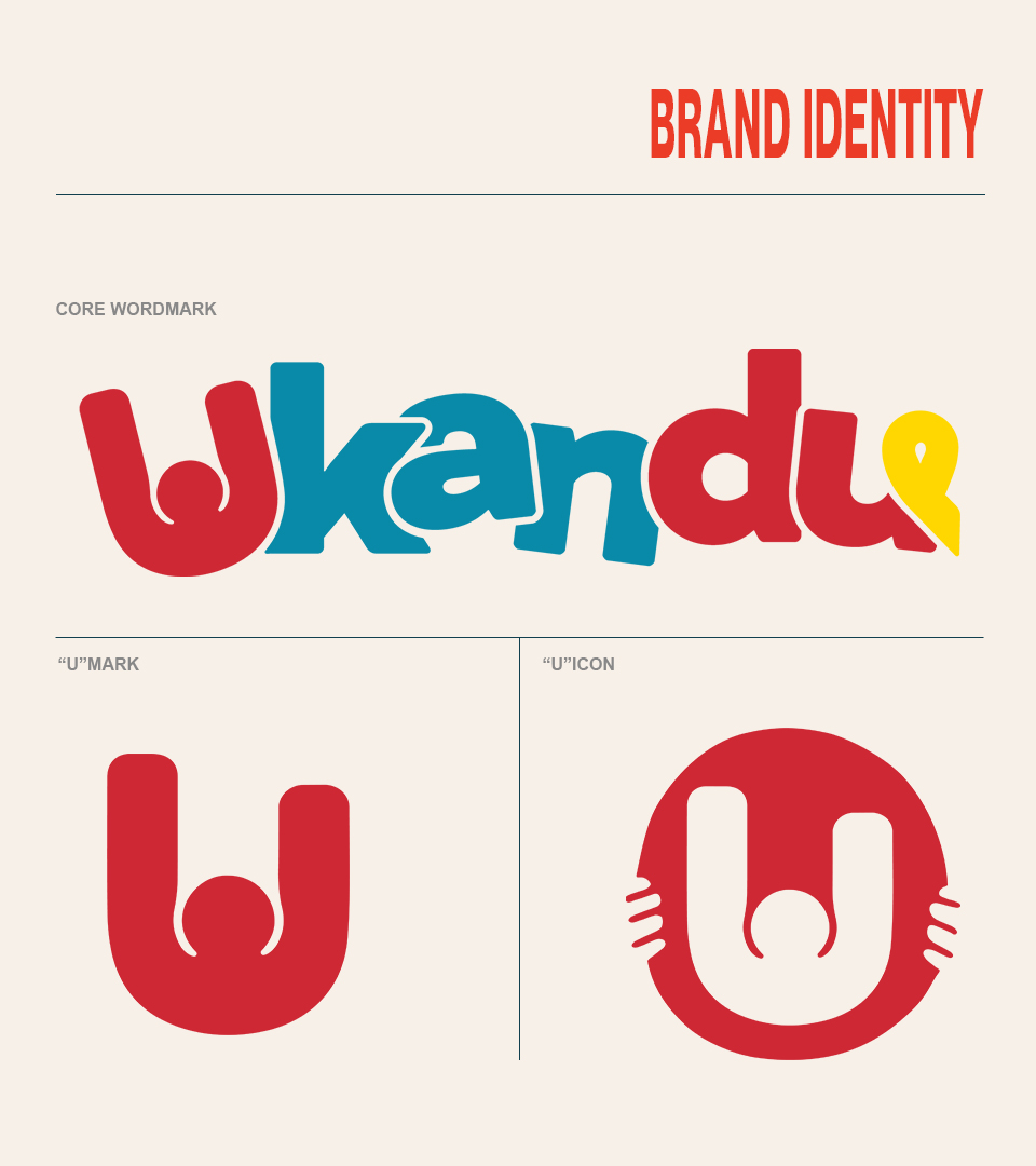
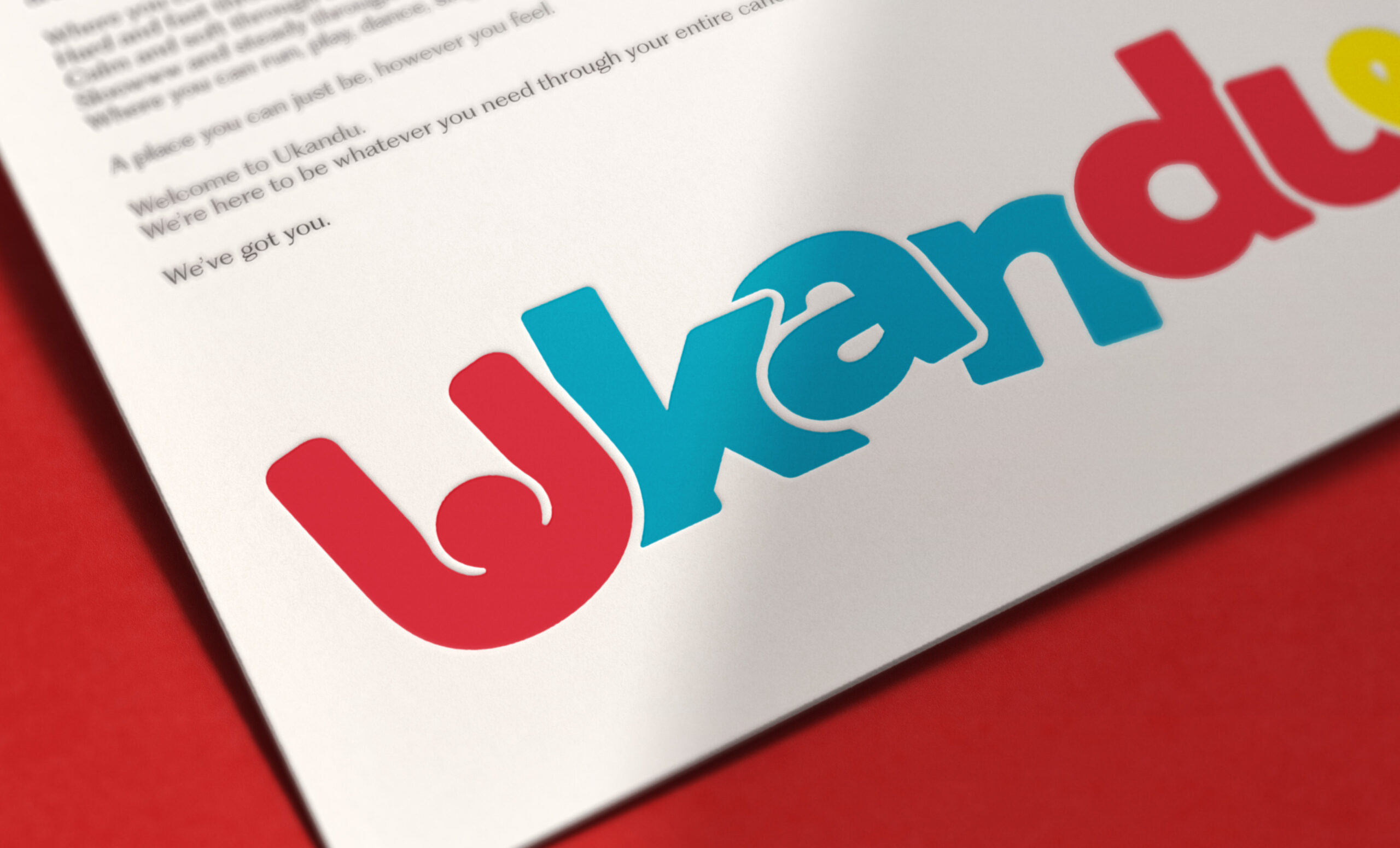
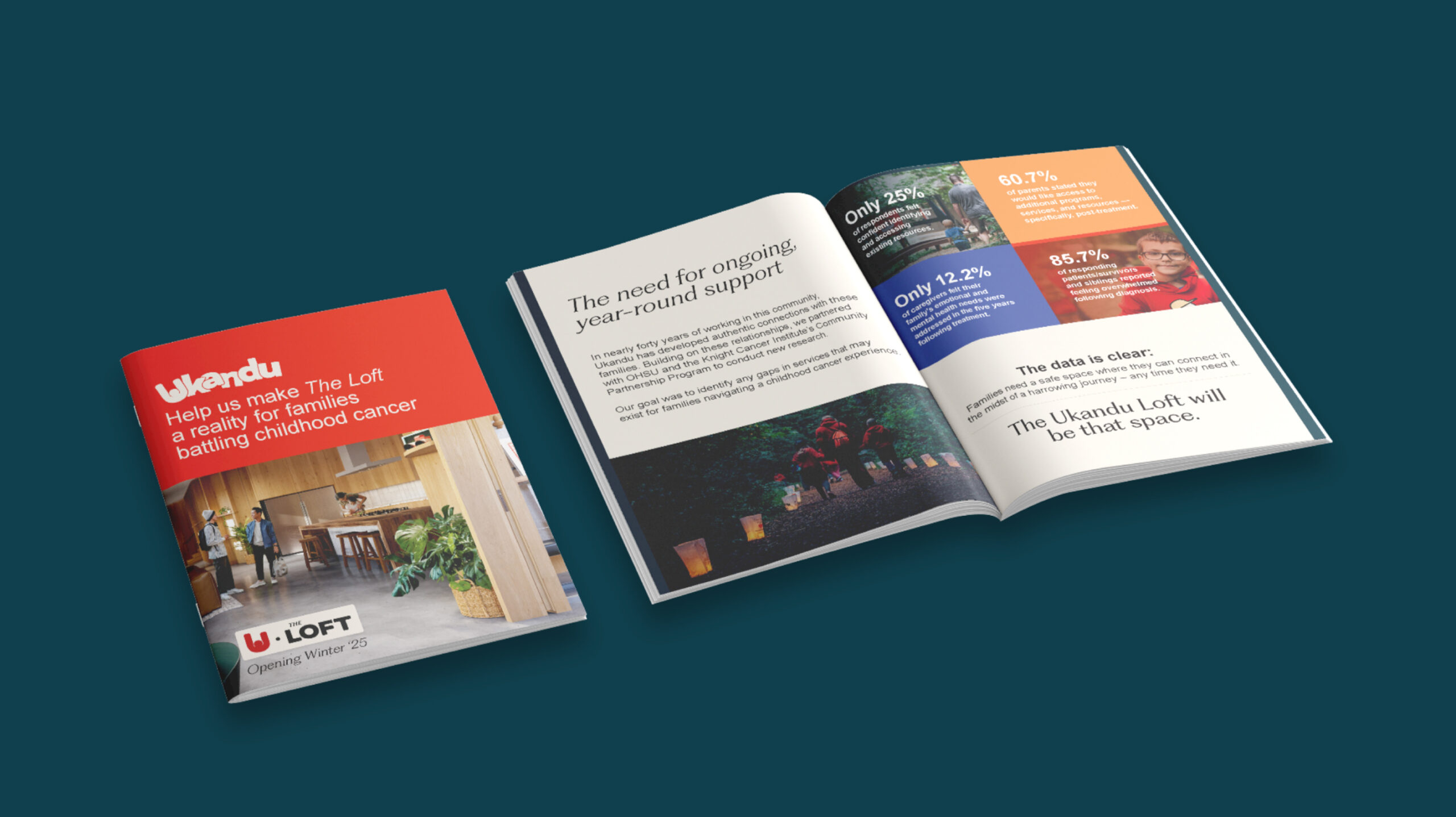
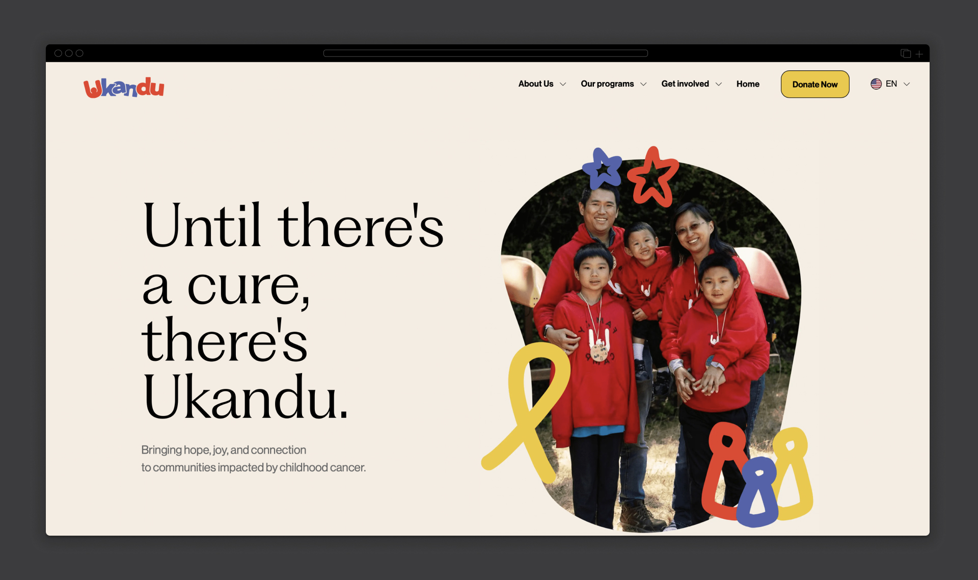
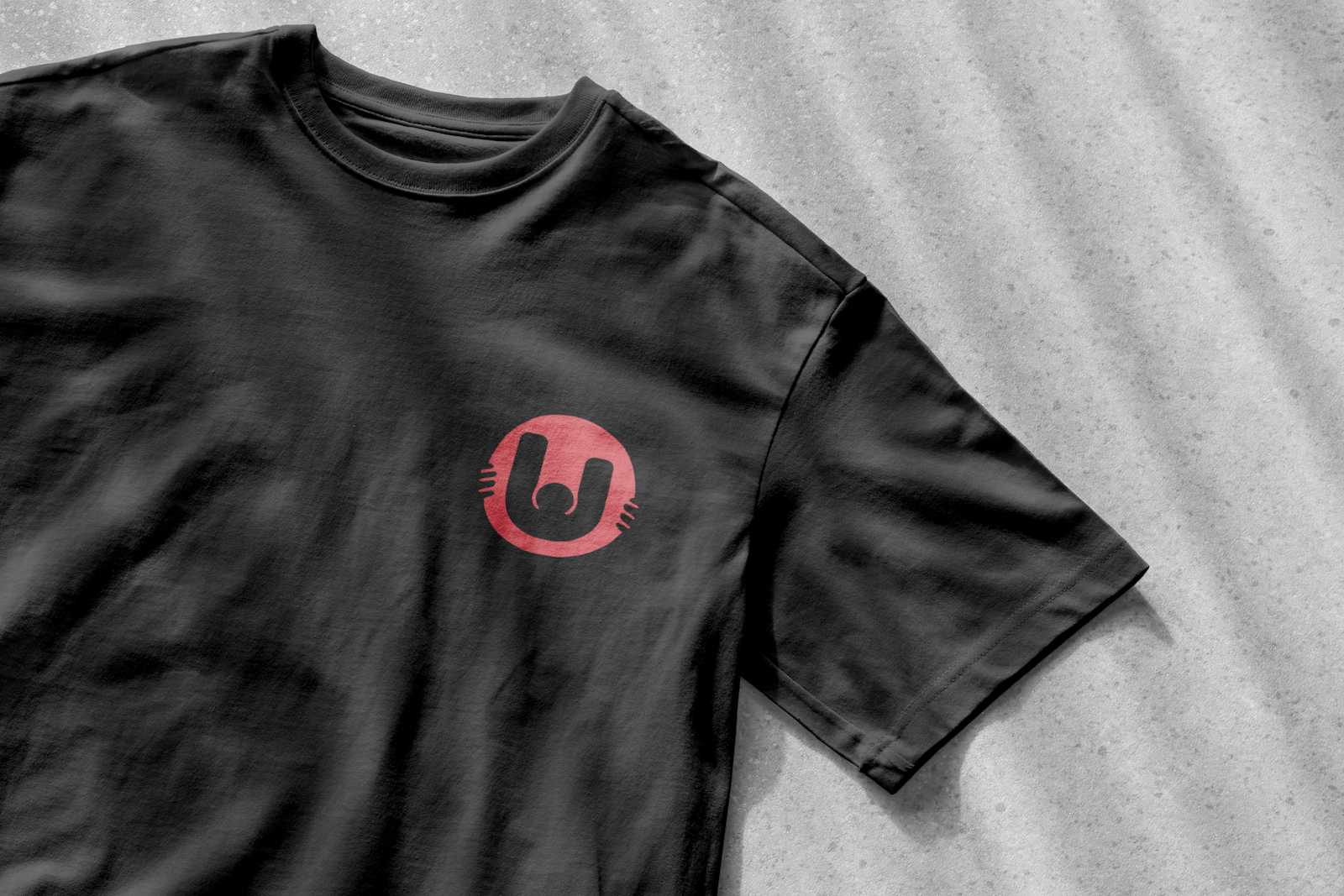
Ukandu is a sanctuary for families battling childhood cancer. It's a free place where the weight of suffering, uncertainty, and feelings of helplessness are confronted by their most worthy adversaries – compassion, community, solidarity and love. In creating an updated brand identity for Ukandu we wanted to reflect this both visually and in the tone in which the brand communicates. Through an extremely collaborative process with the folks at Ukandu we landed on a creative expression centered around heartwarming nostalgia. Through imagery representing a range of emotions with the family; through a diversity of typefaces, illustrated, to serif, to sans serif, matching the energy in each communication; every word and message reflective of its place in this complex journey. And through a thoughtful update to their existing brand marks, maintaining the outstretched arms motif of their iconic "U" while placing it inside a wordmark that exudes warmth, firendliness and childlike wonder.
Credits
Agency: Happylucky | Client: Ukandu | Role: Art Director
Brand Identity
© Dallas Carnahan - 2024
